
Fadé Adeniyi
Wednesday 28 October 2026
Three prompts that turn a website you love into a taste index, a style guide in your own colours and fonts, so Claude builds a page that looks like you and nobody else.
You ask AI for a website and get the page everybody else got. There's a purple gradient, a big centred headline and three matching cards with an icon on each. You've seen it so often you can spot it in a second. Your customers can too.
Adrian Krebs put numbers on it. In April 2026 he scored 1,590 Show HN launches against a list of AI design patterns, including Inter on everything, purple gradients, a centred hero, identical feature cards, coloured stripes down the edge of cards and frosted glass panels. 22% hit four or more of them, 32% hit two or three and 46% hit one or none.
It happens because AI reaches for the most likely answer. Anthropic's own frontend design guide tells Claude it tends to "converge toward generic, 'on distribution' outputs", which users call the "AI slop" aesthetic. Without guidance, it says, Claude often defaults to white and purple. Tailwind's creator Adam Wathan even apologised for making every Tailwind UI button bg-indigo-500, "leading to every AI generated UI on earth also being indigo".
Typing "make it modern and clean" feels like direction, but it describes the page almost every AI site already looks like. Modern, sleek and minimal give Claude nothing to check against. A hex code, a font name and a spacing number do.
Draft for Fadé to approve. I've automated 90% of my tech startup using Claude Code and every page I build today starts with a design reference from Refero. I give Claude the link, ask it to break down what makes the site work, turn that into my own style guide with my colours and fonts, then hand it back to Claude to build.
A taste index is a style guide Claude writes from a website you want to imitate. It lists the fonts, spacing, colours and movement that make that site feel the way it does, written as rules Claude follows when it builds for you. You don't need any design words to make one. Claude does the looking and you make the choices.
Start with a site you'd love yours to feel like. Any site you admire works. If nothing comes to mind, Refero is a library of design references from real products, with more than 145,000 screens and 12,000 user flows, a Figma plugin and an MCP that lets AI agents search it. The free plan shows about 3% of the library. Pro was £10 a month billed yearly when we checked on 28 October 2026.
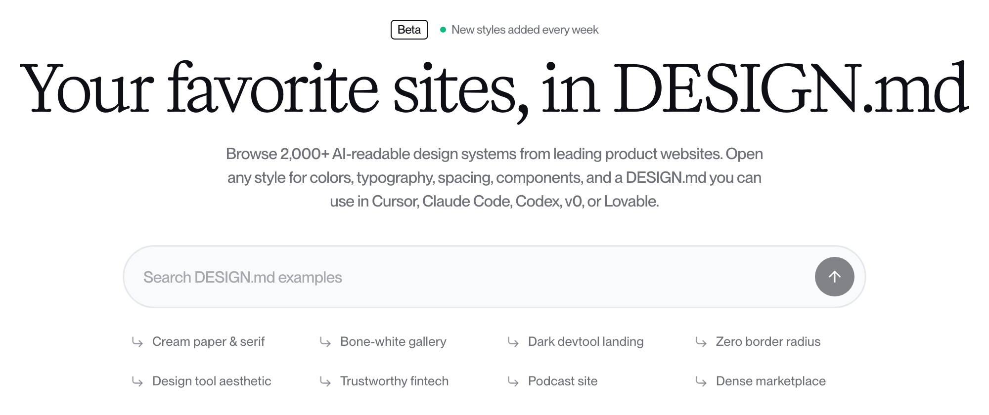
Refero Styles can save you step one. Refero Styles is in beta and holds more than 2,000 design systems taken from real product websites, each written up as a DESIGN.md file. When we checked, you could open a style and copy its DESIGN.md without signing in. Paste that in as your breakdown and go straight to step two.
Learning from how a site looks is how designers have always learned. Never take another brand's logo, words, photos or illustrations. Don't get so close that people could mistake your site for theirs.
1. Ask Claude to break the site down. Paste this with the link. It asks for real values, because a vague description gives Claude nothing to copy.
I want to study the design of this website:
[THE LINK TO THE SITE YOU LOVE]

Open it and break down what makes it work. Give me
exact values wherever you can find them.

FONTS: the fonts for headings, body text and labels,
with sizes, weights, letter spacing and line height.
SPACING: the space between sections, around text and
inside cards and buttons, the grid and the max width.
COLOURS: every colour as a hex code and where it's
used, from the background and text to the buttons.
ANIMATIONS: what moves on page load, scroll and hover,
how fast it moves and how it eases.
THE FEEL: two or three sentences on the mood of the
site and the choices that create it.

If you can't open the page or read part of it, tell
me which part. Don't guess. I'll send screenshots.
2. Turn it into your style guide. Paste this in the same chat with your own colours and fonts filled in. No brand colours yet? Ask Claude to suggest three that suit the feel.
Turn that breakdown into my own style guide called
TASTE-INDEX.md. Keep the feel of the site, but use
my brand:

MY COLOURS: [YOUR HEX CODES AND WHAT EACH ONE IS FOR]
MY FONTS: [YOUR HEADING FONT AND YOUR BODY FONT]
CHANGE THIS: [E.G. ROUNDER BUTTONS, A DARK BACKGROUND]
KEEP THIS: [WHAT YOU LOVED, E.G. THE HUGE SPACING]

Write it as rules another AI can follow: fonts and
sizes, a spacing scale, when to use each colour,
buttons, cards, animations and things to avoid.
Use only my colours and fonts. Don't copy the site's
logo, words or images and don't name the brand.
3. Point Claude at the guide and build. Open a fresh chat, or a Claude Code session in the same folder, attach TASTE-INDEX.md and paste this. In the Claude app, copy the style guide into a file with that name first, so you can hand it over again next time.
Build my [PAGE, E.G. HOME PAGE] using the style guide
in TASTE-INDEX.md. Read the whole file before you start.

WHAT IT'S FOR: [YOUR BUSINESS IN ONE LINE]
SECTIONS: [E.G. HERO, WHAT I DO, PROOF, CONTACT]
MY WORDS: [PASTE YOUR COPY, OR ASK ME FOR IT]

Follow the style guide for every font, colour, space
and animation. If you need something the guide doesn't
cover, ask me before you invent it. Don't fall back on
default fonts, purple gradients or rows of matching cards.

When you're done, list every place you broke a rule
in the guide and why.
One guide, every page. Use the same file for your next page, your sales page and your emails, so everything you build looks like one brand.
Then check it against the slop list. Before you publish, look for the patterns Adrian Krebs counted.
You've now got the three prompts, a place to find references and a list to check the result against. Do one thing today. Open a site you love, paste the step one prompt with its link and read what Claude finds.
What this won't do: it won't give you taste you don't have yet. You still pick the reference and decide what to keep. Claude works from a page's code, so it can misread a site that builds itself in the browser or miss motion that only shows once the page runs. Check its numbers against the real page and send screenshots of anything it missed. A style guide won't fix weak words or an unclear offer either.
Give AI your taste or it'll give you everyone else's.
Sources, opened 28 October 2026: Adrian Krebs, Scoring Show HN submissions for AI design patterns (20 April 2026, automated checks, about 5 to 10% false positives by his estimate); Anthropic, Prompting for frontend aesthetics; Adam Wathan, post on X (7 August 2025); Refero, pricing and Refero Styles. Prices and free access can change.
The Audacity to Build is my community for people doing exactly that. It is opening soon. Join the waitlist and you are first in when it does.
If this was useful, follow me. I share what I am actually building, the tools that survive my own testing, and the ones I quietly cancel. New plays every week.
Pop in your name and email and the guide is yours, along with the occasional new guide when I publish one. No spam, ever.