
Fadé Adeniyi
Friday 30 October 2026
The exact prompts I used to turn a plain list of links into a page that looks like me, three looks to choose from and two ways to put it live, one of them on your own domain for free.
Because it was built from a template everyone else used too. Claude can build you an original page from your own links in one chat: you give it the real links, ask for three looks, pick one, tell it exactly what to change and check it on your phone before it goes in your bio.
I've spent more than sixteen years building products. The first screen decides almost everything. People land, scan for about a second and either tap something or leave. Your link-in-bio is that first screen for everyone who liked a post enough to want more, so it deserves more than a stack of grey buttons.
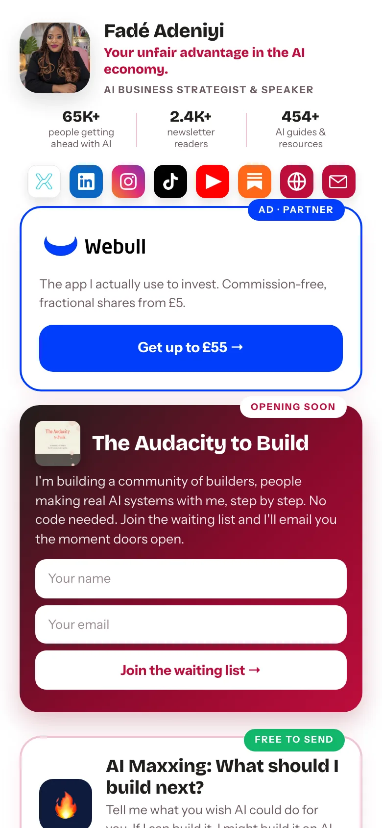
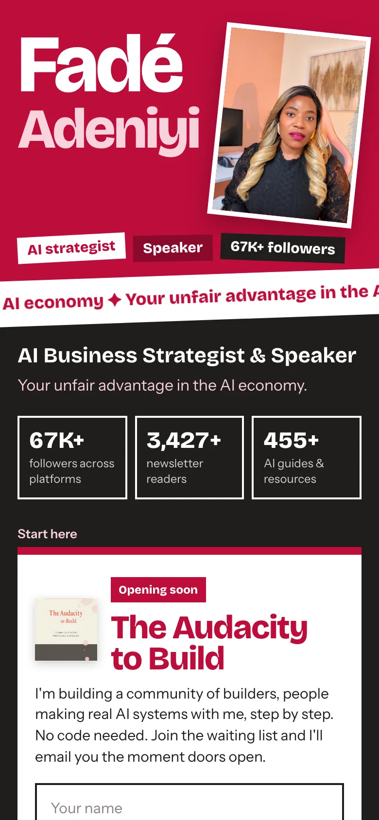
Step 1. Give Claude your real links. Write them down first: your main action, every offer with its price, your free things and your socials. Paste the exact URLs, because Claude can't guess what's behind a button. Then paste this into a new chat.
Build me a link-in-bio page as an artifact. It's for people who tap the link in my Instagram bio, so design it for a phone first.

Use only what I give you below. Don't invent offers, prices, stats or links. If anything's missing, ask me.

Put my main action at the top, then my offers, then my free stuff, then my socials. Make every button big enough to tap with a thumb.

NAME: [YOUR NAME]
BIO: [WHAT YOU DO AND WHO IT'S FOR]
MAIN ACTION: [THE ONE THING PEOPLE SHOULD DO FIRST + EXACT URL]
OFFERS: [NAME + PRICE + EXACT URL, ONE PER LINE]
FREE STUFF: [NAME + EXACT URL, ONE PER LINE]
SOCIALS: [EXACT PROFILE URLS]
PHOTO: [ATTACH ONE PHOTO YOU'RE HAPPY TO USE]
The 5 steps
You don't have to. It's much easier to react to three real options than to describe a design from scratch, so ask Claude to show you three, with the same links in each.
Now show me three completely different versions of this page at phone size.

Keep every link, price and word exactly the same in all three. Only the design changes: colours, fonts, layout and how my photo is used.

Give each version a name and tell me in one line what makes it different. Don't pick one for me.
Same words, different design. If the words change between versions, you can't compare the designs fairly.
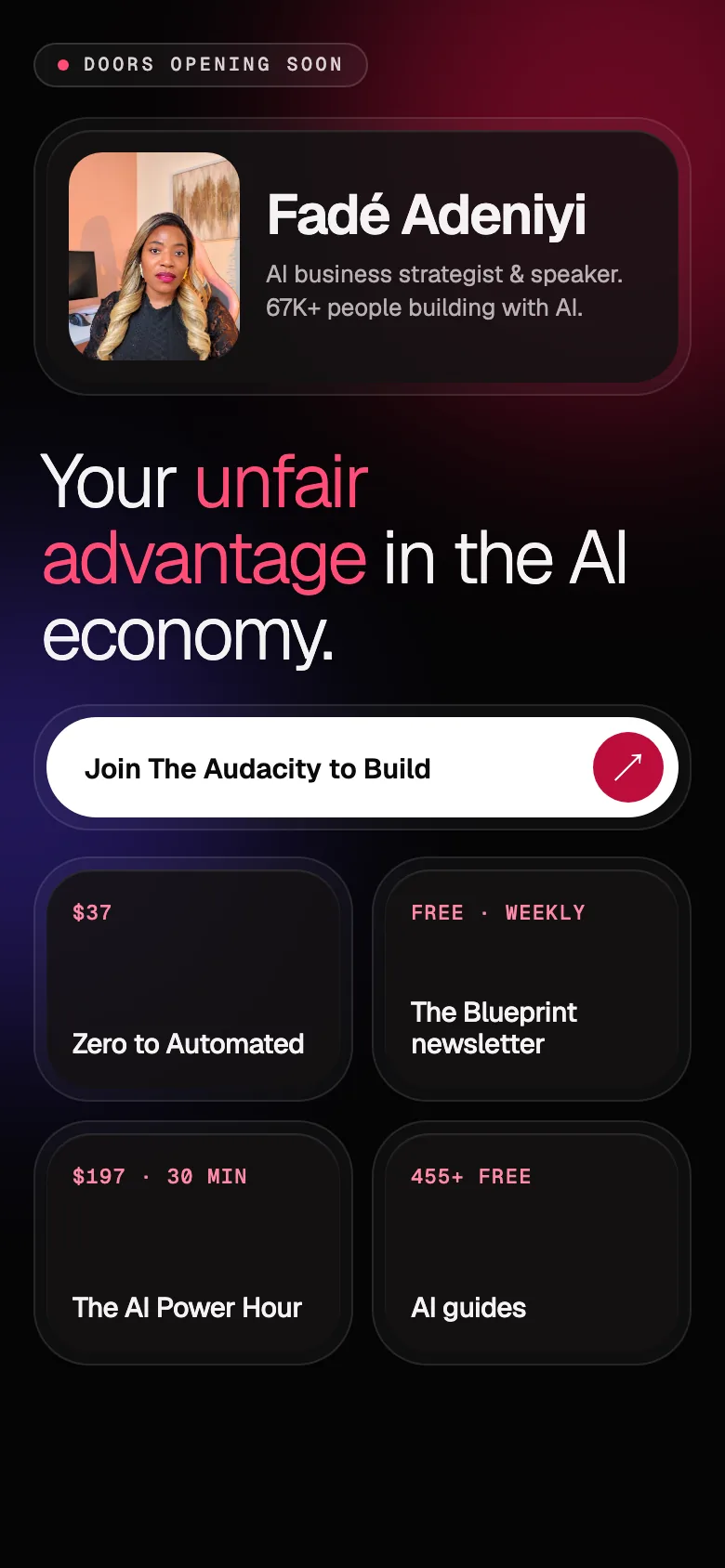
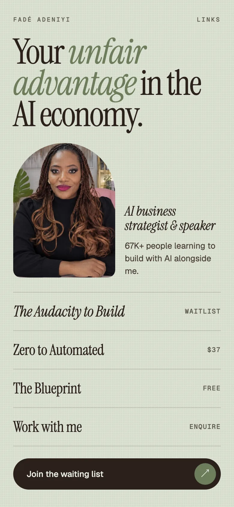
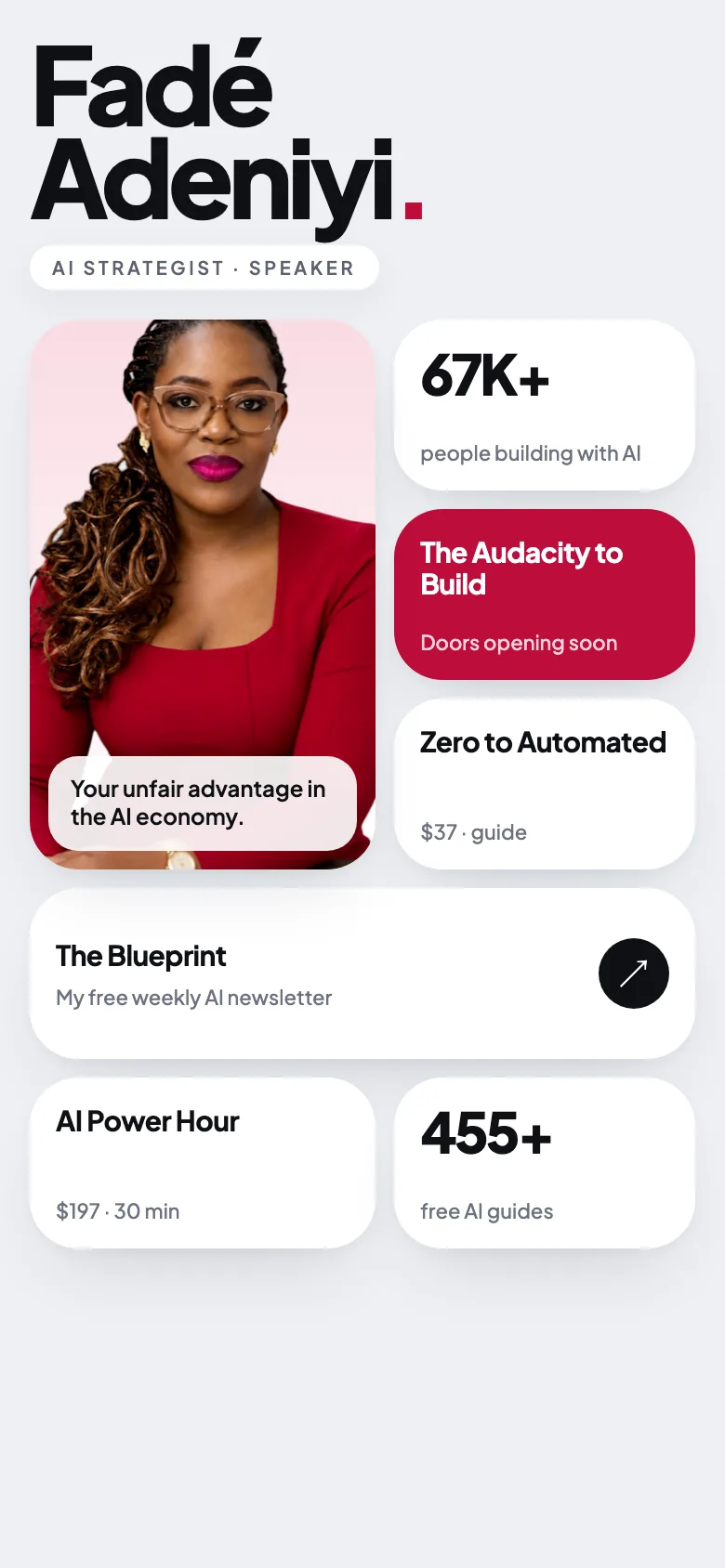
Want to steer it? Ask for any of these by name instead.
Make it dark and glowing. A deep black background with soft crimson and violet light behind everything. Put my links in frosted glass cards and make the main button white, so it's the first thing people see.
Make it calm and editorial. A muted sage green background, a big elegant serif for the headline, my photo in an arch shape and my links as a simple list with thin lines between them.
Make it clean and bright. A soft silver-white background, my name huge at the top, my photo in a tall card and my links in a grid of white cards with very soft shadows.
Pick the version closest to how you want to feel, then change one thing at a time. Name the exact change. "Make it better" gives Claude nothing to work with, but "fewer capitals" gives it a clear job.
I'm going with [THE VERSION YOU PICKED]. Keep every link exactly as it is and change only these things:

1. Use my brand colours: [YOUR HEX CODES]
2. [YOUR CHANGE, E.G. FEWER CAPITALS]
3. [YOUR CHANGE, E.G. ONE PHOTO, TOP RIGHT, SLIGHTLY TILTED]
4. [YOUR CHANGE, E.G. AN IMAGE ON EVERY CARD]

Show me the phone view when you're done.
Say what to keep, too. "Keep every link exactly as it is" stops a small change turning into a whole new page.
Asking for "something more premium" over and over. Each vague request makes Claude redesign everything, so you never get closer. Name one change, look at it and then name the next.
My bio link is the first thing people tap after a reel, so I treat it like a shop window. I rebuilt mine with Claude in one evening. I gave it every link I had, asked for three completely different looks, picked the bold one and then kept telling it exactly what to change: my brand colours, fewer capitals, one photo top right and only my ten newest guides. Now when I launch something new, I ask Claude to add the card and I check it on my phone before it goes live.
Almost everyone who taps your bio link is on a phone, so a page that looks great on a laptop can still fall apart where it matters. Ask Claude to check it, then tap every link yourself.
Check this page at phone width: 360, 390 and 430 pixels wide.

1. Fix anything that runs off the side of the screen.
2. Fix any text that gets cut off.
3. Make any button that's too small to tap bigger.
4. List every link on the page next to where it goes, so I can check each one.
Tap every link yourself. Open the page on your own phone and make sure each button goes to the right place.
Option 1. Publish it on Claude. This is the quickest way and it's free. On the Free, Pro and Max plans, click Publish on the artifact, copy the public link and paste it into your Instagram bio. Your link will be a claude.ai address. On Team and Enterprise plans, artifacts can only be shared inside your organisation, so use option 2.
A published artifact is perfect for links. Sign-up forms on it won't collect emails anywhere, so if you want a waiting list or newsletter box that works, host it yourself with option 2.
Ask Claude for the page as one file, then drop that file onto a free host. You don't need to know any code to do this.
Give me this page as one single file called index.html. Put all the styles and scripts inside it and keep my photo as a link I can swap.

Then tell me which lines to change when I want to update a link or a price later.
With Netlify Drop. Netlify removes a dropped site that nobody claims, so make the free account straight away (Netlify).
Or with GitHub Pages. GitHub Pages is free for public repositories.
You've got the five prompts, three looks to start from and two ways to put it live. Write down your links, paste Prompt 1 and ask for three looks before you decide anything.
What this won't do: it won't tell you what to sell or which link matters most, that part is yours. A claude.ai link isn't your own domain and forms on a published artifact won't collect emails. Free hosts have limits, so read the plan before you rely on one for something important.
Same links, a page that looks like you. People tap what feels made for them.
Related guides: Why every AI website looks the same, Why Google and AI can't find your site and 5 Claude skills that finish your admin before lunch.
Sources, opened 30 October 2026: Claude Help Center, publishing and sharing artifacts; Netlify, thirteen years of Netlify Drop; GitHub Docs, creating a GitHub Pages site. Screenshots are my own pages.
The Audacity to Build is my community for people doing exactly that. It is opening soon. Join the waitlist and you are first in when it does.
If this was useful, follow me. I share what I am actually building, the tools that survive my own testing, and the ones I quietly cancel. New plays every week.
Pop in your name and email and the guide is yours, along with the occasional new guide when I publish one. No spam, ever.